The Art of Color Psychology in Environmental Design: How Colors Speak to Us
Looking for custom sign or graphics option?
1/29/2025
When it comes to designing good environmental graphics, colors do more than just meet the eye – they trigger emotional and psychological responses in your audience. Incorporating strategic color choices into your environmental design is an essential part of the process of creating user experiences that captivate and inspire your target audience in unique ways.
Color psychology is an interdisciplinary field that incorporates architecture, design and psychology in order to understand how our physical surroundings can influence our mental state at any given time. A stronger understanding of how your audience’s mind will perceive a space based on the color choices you make can help you decide what the space should look like.
What colors are best for my space?
Generally speaking, warm colors like red and yellow evoke a sense of energy, and are great for social spaces, while cooler colors like blues and greens are better for calming, relaxation-focused environments (1). Your choices will depend on your industry, what kind of personality your business hopes to convey, as well as what each individual space is being used for within a larger building.
When it comes down to picking the right shade for you and your environment, think about the associated psychological effects that they may bring for your staff and guests.
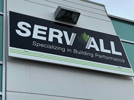
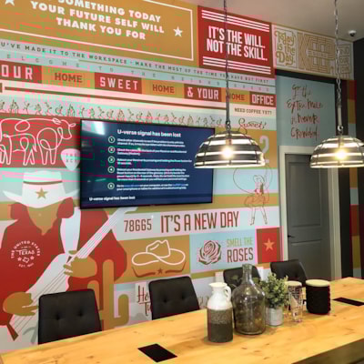
- Red: Red is a bold, bright color that is linked to passion and power. It can quickly raise the energy level of any area but can also be overwhelming when there’s too much of it. Using it as an accent can help drive a desired sense of action in a workplace.
- Orange: Great for evoking feelings of warmth, orange is a refreshing warm tone that is associated with energy and success. It’s often seen at gyms thanks to this association, but in an office, can help boost productivity by keeping energy levels up.
- Yellow: Bright and sunny, yellows are a great mood-booster in any environment thanks to their association with joy and happiness. Of course, they’re equally known for being aligned with safety and caution, making them a good choice for a variety of workplace situations.
- Green: The color of nature, greens are linked to feeling refreshed and renewed. They’re great for areas where relaxation is the goal, such as break rooms, reception areas or in healthcare settings.
- Blue: Cool and calming, blues create a sense of peace that allows your audience to exhale and enjoy. They’re good in workplaces for enhancing focus and productivity but can also be used to inspire a sense of confidence and reliability.
- Purple: The color of royalty, purples are ideal in customer-facing environments to create a sense of wealth and luxury, helping to appeal to a buyer’s sense of receiving a high-end experience.
- Black: Stark and bold, black provides a sense of strength and power – but it can also lend a sense of sophistication. As a very dark color, it’s wise to use black as accents, rather than flooding a space with it, which can cause an area to feel small and shut-in.
- White: Associated with purity, simplicity and cleanliness, white is a great starting point for many kinds of spaces. It’s frequently used in healthcare environments to create a sense of sterility and cleanliness, but too much can become stark; use it as a base for other colors.
- Grey: A neutral area between black and white, greys are great for conveying that exact kind of balance. It’s a versatile color often used for hallways, reception areas and offices thanks to its timeless nature.
- Brown: Thanks to being an earth tone, brown is associated very closely with nature. It’s used often in conjunction with greens to develop that sense of serenity and renewal that comes with a more natural environment.
What else do I need to consider in my design?
Workplace layouts go well beyond color choices. You’ll want to ensure that your goal – whether it be fostering collaboration, increasing productivity, inspiring purchases or anything else – can be met through other means of environmental design.
Emerging trends in design have helped make spaces of all kinds more aligned with the goals that drive them. Minimalism and eco-friendly designs are both at the forefront of these trends, with many designers going out of their way to reduce visual clutter, or to bring the outdoors in. Being environmentally friendly with your design can also help enhance your brand reputation among your customers, too!
You’ll also want to consider overall comfort at work though ergonomics, which can involve choosing what kind of desks and chairs your employees receive – but also boils down to having an overall comfortable, well-designed workspace. A happy staff is a more motivated, productive staff!
Leveraging color psychology in your design is an art, but we’re here to help. Contact us for a free consultation on how your workplace or storefront can be improved through clever use of color.
(1) https://www.archute.com/psychology-of-space/
Looking for custom sign or graphics option?
Back