Indoor signs

10/2/2025
When it comes to visual communication, signs and graphics are some of the most powerful tools a business can use. Whether it’s a bold storefront sign that draws customers in, a window graphic that shares your hours, or a vehicle wrap turning heads on the highway, great signage does more than just decorate—it communicates clearly, quickly and memorably.
But behind every clean, compelling sign is a thoughtful design process that balances creativity with function. At Image360 Tulsa East, we’ve helped businesses of all sizes turn simple ideas into eye-catching signs and impactful graphics. And while every project is unique, the best designs almost always rely on a few trusted tricks.
Let’s pull back the curtain and explore the design principles that make signs work—and how you can use them to get noticed.
Designing a great sign starts with a simple question: What does this sign need to do?
Are you welcoming customers in? Directing traffic? Promoting a limited-time sale? Informing people of safety regulations?
The function of your sign should drive the design. A directional sign, for example, should be ultra-simple—bold text, clear arrows, and high contrast. A promotional banner might allow for more visual flair, but still needs to communicate a core message at a glance.
Signs that try to do too much and say everything to everyone often end up doing very little. Focusing your design around one key message or action gives your audience a better chance of remembering it.
The biggest mistake people make in signage design? Assuming it will be read up close.
The truth is most signs (especially outdoor signs, vehicle graphics, and trade show displays) need to be read quickly and often from far away. That means font size, spacing and contrast are critical.
A good rule of thumb: for every 10 feet of viewing distance, your text should be at least 1 inch tall. So, if someone needs to read your message from 50 feet away, your text should be about 5 inches high or larger.
Also important: choose fonts that are clean and legible. Avoid thin, overly stylized, or script fonts for main messages. And make sure there’s a strong contrast between your text and background. Black on yellow? Great. Light gray on white? Not so much.
The best signs don’t say a lot; they say the right things.
In signage, less truly is more. Your audience may have just a few seconds to glance at your sign, especially if they’re driving or walking past. That means your design should be stripped down to the essentials: a headline, a logo, a key phrase and maybe a website or phone number.
This doesn’t mean your design has to be boring—just intentional. Use bold shapes, strong lines, and focused layouts to guide the viewer’s eye. Let each element have room to breathe.
White space (or negative space) is your friend. It helps create focus and makes your sign feel more polished and professional.
Color does more than make your sign look good. Iit influences how people feel and respond.
For example:
Red grabs attention and signals urgency. Great for sales and clearance signs.
Blue conveys trust and reliability. A good choice for professional services.
Green often signals health, growth, or environmental focus.
Black and white can feel bold, timeless, and high-end.
But beyond emotional impact, color plays a technical role: enhancing contrast and readability. You want your key information to stand out, not blend into the background.
Make sure your color choices work under real-world lighting like sunlight, shade, headlights, or indoor fluorescents. A design that looks great on screen might fall flat in bright sunlight or at night. That’s why we often provide color proofs or recommend materials that enhance visibility based on location.
Designing a sign in isolation is like designing a suit without knowing where you’ll wear it. The context matters.
Will your sign be placed on a glass door, a brick wall, or a moving vehicle? Will people view it from the sidewalk or a busy highway? Indoors under bright lights or outdoors in changing weather?
Each of these environments comes with unique design challenges. For example:
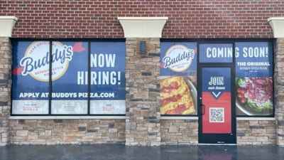
Window graphics might need to incorporate transparency or avoid blocking sightlines.
Vehicle wraps must consider the curves, handles, and contours of the vehicle.
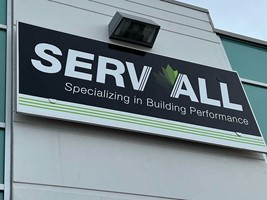
Storefront signs need to stand out from surrounding buildings, greenery, or signage clutter.
At Image360 Tulsa East, we always think about installation location during the design phase, not as an afterthought. That means using mockups, measuring sightlines, and choosing materials that hold up under specific conditions.
Great branding isn’t just about having a nice logo—it’s about using that logo (and colors, fonts, and tone) consistently across every sign and graphic.
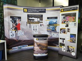
Whether it’s your main building sign, interior wall graphics, window decals or trade show banners, each element should look and feel like part of the same brand family. This kind of visual consistency builds familiarity, trust, and a stronger brand identity over time.
Using your brand style guide is incredibly helpful here. It ensures that every vendor, designer, or printer you work with is using the same rules like color codes, spacing and logo versions. And when that consistency extends across physical signs, vehicle graphics, digital ads, and print, your brand becomes instantly recognizable.
Sometimes, we’re too close to our own designs to see what’s missing or what’s confusing.
That’s why it’s smart to get outside feedback before your sign goes into production. Show it to someone unfamiliar with the project. Ask them what stands out first, what the message is, and if anything feels unclear or unnecessary.
Also, look at the design at full size (or a printed mockup) from a distance and in different lighting. What looks balanced on a screen might feel off when viewed on a 6-foot banner from across a parking lot.
It’s always easier and cheaper to make design tweaks earlier on than to reprint or reinstall after the fact.
At the end of the day, the best signage design isn’t about being the flashiest; it’s about being the clearest. Whether your goal is to attract attention, guide visitors, or reinforce your brand, every element of your sign should be working toward that goal.
Great design doesn’t just happen. It’s the result of smart choices, real-world testing, and a deep understanding of how people see and read in everyday environments.
Image360 Tulsa East specializes in signage and graphics that combine creativity with purpose. From concept to installation, we help businesses like yours create visual solutions that truly work—on the wall, on the road, and everywhere in between.
Need help designing your next sign? Let Image360 Tulsa East help bring your message to life.