Top 10 Signage Best Practices for 2026
Looking for custom sign or graphics option?
1/5/2026
If you’ve ever watched someone spin in a lobby like a confused Roomba, you already know: good signage is a public service. In 2026, signage is doing more than identifying spaces—it’s shaping experiences, reinforcing brands, improving accessibility, and guiding people smoothly through real-world environments (and real-world attention spans).
This Blog Is For You If You're Involved With:
- Schools: If parents and visitors ask “Where’s the front office?” more than once a day, you’re overdue for a wayfinding refresh.
- Apartments & developments: If delivery drivers and guests keep calling from the parking lot, building IDs and parking guidance will pay for themselves.
- Medical & dental offices: If check-in runs behind because patients wander the wrong hallway, room IDs and directional signage can calm the chaos.
- Retail & restaurants: If lines stall at the counter, “Order / Pick-Up / Restrooms” signage improves flow (and everyone’s mood).
- Events: If your attendees treat the venue like an escape room, your directional signage needs a glow-up.
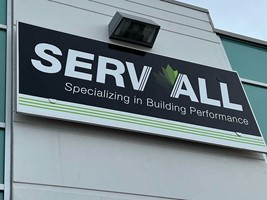
1. Sign Design That Works: Humans First, Brand Second (Yes, You Can Have Both)
Best practice: Prioritize clarity, legibility, and user experience before visual flair.
Why we suggest it: The prettiest sign in the world still fails if people can’t read it quickly—or if they only realize what it says after they’ve walked past it. In busy spaces, readers give you seconds, not minutes.
Houston tip: Between sunshine glare, tinted glass, and fast-moving foot traffic, contrast and simple messaging win.
- Schools: High-contrast hallway wayfinding (“Main Office →”, “Cafeteria ←”) placed at decision points.
- Apartments & developments: Clear building IDs and parking guidance so visitors don’t end up touring the wrong building.
- Medical offices: A simple “Check-In” sign beats a beautifully branded sign that reads like abstract art.
- Retail & restaurants: “Order Here,” “Pick-Up,” and “Restrooms” in large, readable type so lines move faster.
2. ADA-Compliant Signage in Houston: Make Compliance a Design Feature
Best practice: Integrate ADA-compliant signage seamlessly into your overall design system.
Why we suggest it: ADA signage isn’t just a requirement—it’s a signal that you care about access and clarity. And in 2026, compliance can absolutely be stylish.
Quick compliance refresher (the two most missed details):
- Mounting height: Tactile characters must be installed so they fall between 48" minimum and 60" maximum (measured from the baseline of the tactile characters).
- Placement at doors: When a tactile sign is provided at a door, it must be on the latch side (with specific rules for double doors).
Houston tip: In high-humidity spaces (hello, Bayou City), choose durable substrates and adhesives for tactile and braille signs—especially near restrooms and exterior entries.
- Medical & dental offices: Tactile room IDs (“Exam 1,” “X-Ray,” “Hygiene”) with braille, installed consistently at the correct locations.
- Schools: Tactile classroom numbers and administrative room signage that matches campus branding.
- Apartments: ADA-compliant amenity and restroom signage that looks intentional—clubhouse, gym, pool entries.
- Restaurants & retail: Restroom and exit signage that’s compliant, consistent, and easy to spot.
3. Wayfinding Signage in Houston Works Best as a System (Not Random Acts of Signage)
Best practice: Design signage as a cohesive system (fonts, colors, rules, placements), not a collection of one-off decisions.
Why we suggest it: When signage feels unified, people navigate faster—and your brand looks instantly more polished. Plus, future additions are easier when you’ve already established rules.
Houston tip: Rapid growth and tenant turnover are real here. A scalable system keeps you from “patchwork signage” as you expand.
- Apartment communities: Monument sign + building IDs + unit numbers + parking + amenity wayfinding that all speak the same design language.
- Schools: Campus directories, room IDs, and directional signs for parents and teachers using one standardized layout.
- Medical campuses: Suite numbering and department wayfinding that reduces late arrivals (and front-desk stress).
- Office buildings: Consistent suite IDs + directories, so visitors stop asking your receptionist for directions.
4. Design Signage for Change: Modular, Updatable, and Not Painful
Best practice: Use modular, easily updatable signage wherever names, tenants, or rooms might change.
Why we suggest it: Change is inevitable—rebrands, new tenants, room repurposing, expanding departments. Updating a panel is cheaper than replacing an entire sign.
Houston tip: For multi-tenant properties and medical plazas, plan for frequent directory updates.
- Medical offices: Changeable suite directories and physician panels.
- Office buildings: Slide-in directory systems for tenant turnover.
- Schools: Interchangeable room plaques for program changes (“STEM Lab” becomes “Robotics Lab”).
- Retail centers: Tenant panel updates that don’t require replacing the whole pylon sign.
5. Houston Wayfinding = Experience Design (Not Just Arrows)
Best practice: Build wayfinding as a journey—anticipate questions people will have before they’re lost.
Why we suggest it: Great wayfinding reduces stress, improves traffic flow, and makes spaces feel more welcoming. It’s the difference between “Where am I?” and “Oh—got it.”
Houston tip: Large campuses and sprawling developments benefit from layered wayfinding: monument signs + entry directories + confirmation signs along the route.
- Hospitals & clinics: Clear pathing from parking → lobby → check-in → departments.
- Apartments: From the entrance to leasing, guest parking, amenities, and building access points.
- Schools: Parent drop-off and visitor check-in routes that reduce morning chaos.
- Event venues: Flow from parking → entry → registration → sessions → exits (and add “You Are Here” maps when possible).
6. Best Materials for Houston Signs: Choose Like a Texan Chooses Footwear—Practical and Good-Looking
Best practice: Match materials to the environment—UV exposure, moisture, cleaning chemicals, vandal resistance, and lifespan.
Why we suggest it: The right material choice protects your investment, keeps maintenance low, and reinforces quality.
Houston tip: Heat, humidity, and intense sun make UV-resistant finishes and outdoor-rated materials non-negotiable.
- Apartment monuments: Durable aluminum/composite with premium finishes that hold color.
- Schools: Impact-resistant materials for corridors and gym areas.
- Medical & dental: Surfaces that handle frequent sanitizing without hazing or peeling.
- Restaurants & retail: Easy-to-clean wall graphics and signage that still looks sharp under heavy traffic.
7. Readability in the Real World: Distance, Motion, and Houston Sun Glare
Best practice: Test readability at the distance people will actually view the sign (often while walking).
Why we suggest it: People don’t stop and admire signage like it’s a museum exhibit. They glance while moving. Design for that.
Houston tip: Sunlight + glass storefronts + bright parking lots = glare. Use high contrast and finishes that won’t wash out.
- Events: Banners with large type and simple messages (“Main Entrance,” “VIP Check-In”).
- Schools: Gym and auditorium signage readable from across a foyer.
- Medical offices: Directional signs that reduce “wrong hallway” wanderings.
- Apartments: Parking and building numbers that are visible at night and from a vehicle.
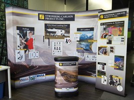
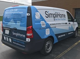
8. Houston Event Signage & Temporary Signs: Make It Look Like It Belongs (Even If It’s Only Here This Weekend)
Best practice: Treat temporary signage as part of the brand experience—clean, consistent, and intentional.
Why we suggest it: Temporary doesn’t have to mean sloppy. Pop-ups, seasonal campaigns, and activations are everywhere in 2026—and they still represent your brand.
Houston tip: Weather shifts happen fast. Choose weather-resistant banners and secure installation methods for outdoor events.
- Events: Branded step-and-repeat backdrops, sponsor boards, A-frames, and directional coroplast that match the event identity.
- Retail: Seasonal window graphics and promotional signage that looks designed (not taped-on).
- Schools: Graduation and open house banners that feel celebratory and on-brand.
- Apartments: Leasing promos and “Now Leasing” banners that align with permanent signage aesthetics.
9. Trendy vs. Timeless: Keep Your Signage Modern Without Time-Stamping It
Best practice: Use trends sparingly; anchor the system in timeless typography, spacing, and hierarchy.
Why we suggest it: Ultra-trendy signage can date quickly—meaning more replacements sooner. A smart balance keeps signage modern without becoming a time capsule.
Houston tip: For fast-growing brands (and fast-changing spaces), build a timeless base and swap accents seasonally.
- Fitness & lifestyle: Bold type and energetic color accents—paired with clean layouts that age well.
- Medical & dental: Calm, high-trust aesthetics with subtle brand color cues.
- Restaurants: A signature look that still works when menus and promotions evolve.
- Schools: A consistent identity that survives leadership changes and rebrands.
10. Houston Sign Permits & Installation: Bring Your Sign Partner In Early (It’s Cheaper Than a Redo or Rush)
Best practice: Loop signage experts into the design/planning phase—before final finishes, walls, and permits.
Why we suggest it: Early collaboration prevents costly revisions, ensures code/ADA alignment, and opens up more creative, integrated solutions.
Houston tip: The City of Houston regulates and permits many advertising signs, and permits must be obtained before signs can be erected, altered, or repaired (with limited exceptions).
- New developments: Coordinating monument sign placement, sightlines, and lighting early.
- Medical buildouts: Planning room IDs, directories, and wayfinding before paint and wall finishes are finalized.
- Retail & restaurants: Aligning storefront signage with landlord criteria and permitting timelines.
- Events: Planning sponsor signage, staging, and traffic flow before load-in day.
Ready to make your signage easier to read, easier to navigate, and easier to keep compliant?
If you’re in the Houston area, Image360 Katy can help you plan a sign system that’s clear, on-brand, and built for Houston conditions (sun, humidity, and all).
What we can do for you:
- A quick site walk / sign audit (wayfinding + ADA + safety)
- A signage plan with recommended placements and a scalable system
- Fabrication + installation support, including navigating Houston permitting where applicable
Send us your floor plan (or just your address and a few photos). We’ll map out smart next steps—and keep it painless.
Final Thoughts
Great signage in 2026 is clear, inclusive, flexible, and intentional. When done right, it quietly supports people, strengthens brands, and makes spaces feel easier to navigate—like the building is helping you out.
If you’re planning a new project or refreshing existing signage in Houston, these best practices will set you up for long-term success.
Need a hand? Image360 Katy specializes in wayfinding, ADA-compliant signage, safety signage, and event signage—with designs that look great and work even better.
Looking for custom sign or graphics option?
Back