Indoor signs

11/17/2025
When most businesses design a logo, they focus on how it looks on a website or business card. But if your brand will ever appear on a building, vehicle, monument sign, interior wall, or trade show display, your logo needs to be created with signage in mind from the start.
At Image360 Woodbury, we often see beautiful digital logos that become difficult, expensive, or even impossible to turn into effective signs. Thinking about signage early can save time, money, and frustration later.
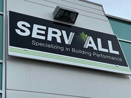
Fancy scripts, thin lines, and tight kerning (letters spaced closely together) may look stylish on paper, but they often fall apart on large signs. Thin strokes disappear when illuminated, stylized scripts are hard to read, and tight spacing becomes even tighter when scaled. Choose clean, bold, well-spaced fonts for maximum visibility. Simpler is often better.
If your business name is long, every character must shrink to fit within the square footage allowed by landlords or city codes. Smaller letters mean reduced readability from the street. This is why many businesses use shorter versions, initials, or stacked layouts for signage.
Colors behave differently on backlit signs, LED channel letters, and printed panels. Bright colors can wash out at night, dark tones can look muddy, and gradients often don’t translate well to dimensional materials. A signage-smart color palette ensures visibility in all lighting conditions.
A logo that looks perfect on your screen may be unreadable from the road. Consider traffic speed, sign height, daylight vs. nighttime visibility, and how fast people need to process the information. Good signage focuses on clarity at real viewing distances.
From letter height and illumination to mounting methods and overall size, signage is governed by strict guidelines. Multi-tenant buildings and historic districts often have even more limitations as too much variation can make a building look too busy. Your logo must be designed in a way that can legally be fabricated and installed.
Thin outlines, delicate details, and complex textures don’t translate well into dimensional signage or routed materials.
Designing with real fabrication methods in mind keeps your logo consistent across all applications.
A logo isn’t just a digital graphic—it’s your visual identity out in the real world. If signage is an afterthought, you risk reduced visibility, higher costs, and unnecessary redesigns.
✓ Strong and readable
✓ Fabrication-friendly
✓ Code-compliant
✓ Effective in both digital and physical spaces
If you’re designing (or redesigning) your logo, start with signage in mind. And consider partnering with Image360 Woodbury to make sure your brand looks great everywhere it appears.