Indoor signs

9/29/2025
If you manage or design a commercial building, you’ve been told that certain signs—restroom IDs, room names, exit markings—must meet ADA (Americans with Disabilities Act) standards. One of the most common surprises we encounter is that ADA signs may not all be as small (or the same size) as you might think.
Here’s why!
The ADA Standards for Accessible Design (Section 703) require minimum character heights, contrasting colors, spacing, and tactile features so people with low vision or other impairments can locate and read signs. These aren’t optional guidelines; they’re federal requirements.
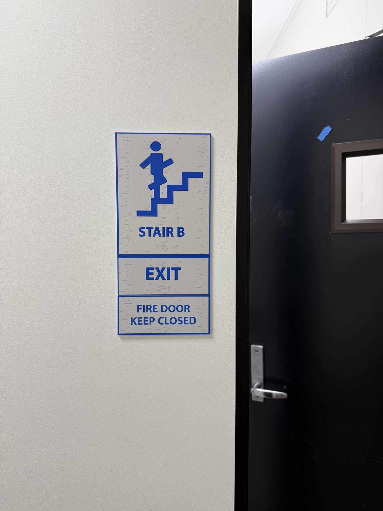
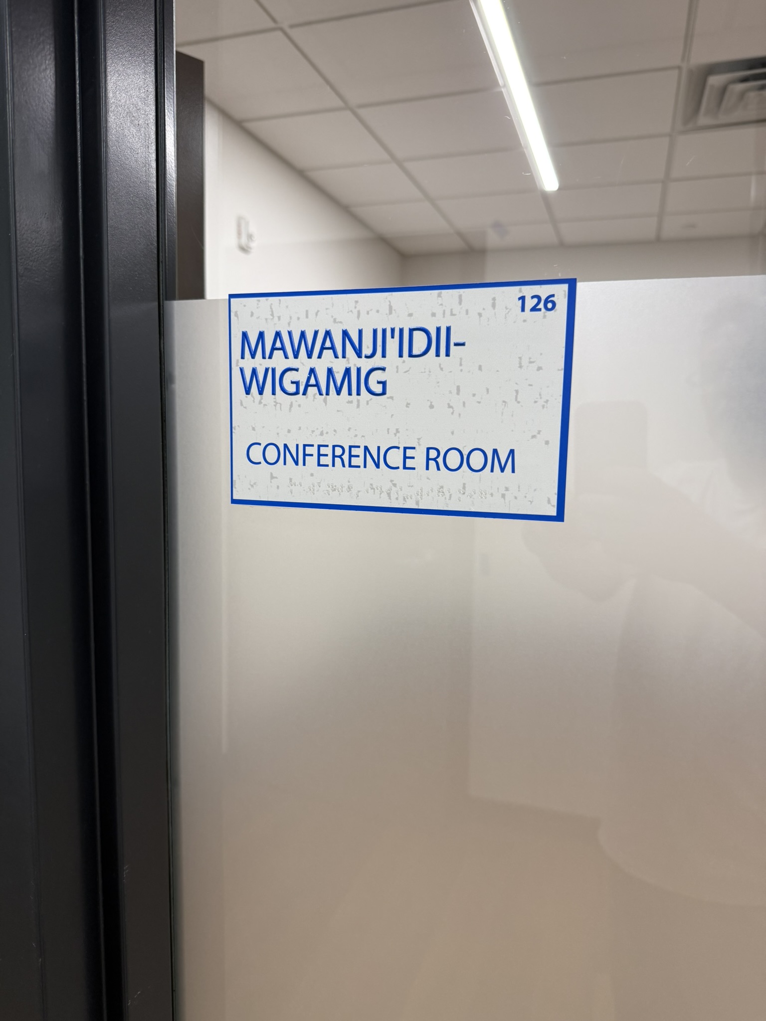
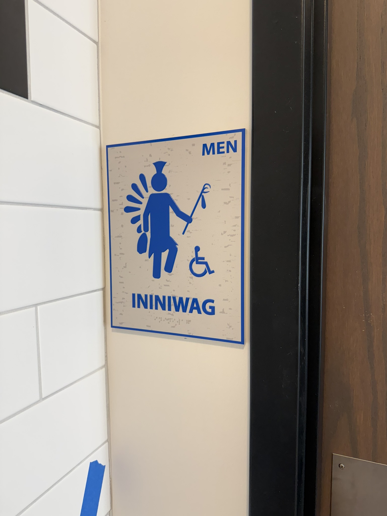
For example, raised letters on room identification signs must be at least 5/8 inches (16 mm) high and sometimes up to 2 inches or more depending on mounting height and viewing distance. Braille must be placed directly below the text in a specific cell size. Those requirements take up real estate on that sign panel – which is why signs with lot’s of letters may need to be larger than you realize.
 |
 |
 |
The ADA ties character size to how far away a person is expected to stand. If a sign is placed high on a wall or above a doorway, the text must be large enough to be read from the floor. As viewing distance increases, letter height must increase, too.
This means that even if your available wall area is small, the law may still require a larger letter size—forcing a larger overall sign panel.
It’s not just the letters. ADA requires:
These factors expand the sign’s “real estate” beyond what you’d need for the same words in a non-ADA sign.
When you ask for a small sign, for example, a 4″×4″ plaque for a long room name—we may have to explain that it simply won’t fit while still meeting federal standards. Shrinking the letters or squeezing Braille closer would make the sign non-compliant and potentially expose your facility to legal liability.
Instead, you might need:
ADA signage isn’t just a box to check. It’s about making sure everyone, including those with visual impairments, can navigate your building safely and independently. By following the prescribed sizes and layouts, you protect your visitors, your staff, and your business from accessibility complaints or fines.
As a sign company experienced in ADA design and production, we:
So next time you need ADA signage for your commercial property, please reach out to us here at Image360 Woodbury and we can ensure that not only are ADA requirements met, but also your signs incorporate some of your branding or building design elements.