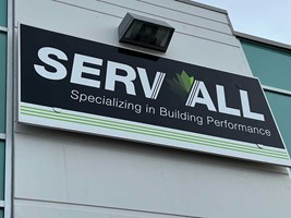
Is your messaging clear to everyone?
Looking for custom sign or graphics option?
12/3/2024
Are you confident that your signs are effectively reaching your entire intended audience in a welcoming, educational manner? For millions with disabilities, especially those with visual impairments, proper signage is critical for their safety, well-being and independence.
As of 2022, 27 percent of Canadians aged 15 and up had at least one disability (1). Of these, two of the leading disabilities were related to sight or mobility. Having proper signage ensures that these individuals are able to navigate your space with ease.
How can you improve accessibility in your space? Here’s a few things to keep in mind:
Visual considerations
Your signs should be accessible to individuals with low vision, and may include raised characters, pictograms or visual characters. Text and their background should have a matte or non-glare finish in order to ensure that any lighting in the area does not interfere with the ability to read the message. The characters should also contrast with the background (either with light characters on a dark background, or vice-versa).
Tactile considerations
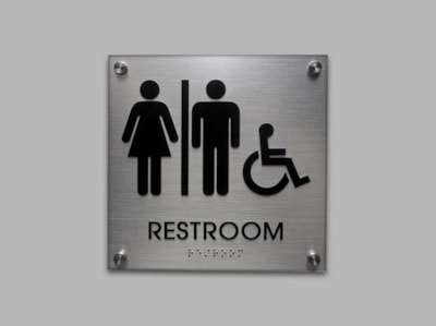
Those who are blind or have low vision may need to read by touching the sign itself. Your signs should therefore have raised characters and/or braille in order to be read by these individuals. When using braille, make sure that you use Grade 2 braille, or contracted braille.
Where does my accessible signage need to go?
Ideally, all of your signs should have a degree of accessibility built in. However, there are some places that are more important than others in terms of accessible sign placement.
- Doors: Accessible signs are generally required at the doorway of every permanent room and space. For single doors, tactile signs should be placed on the latch side of the door.?For double-leaf doors (also known as French doors or double doors), the sign should be placed on the inactive side if there is one (or to the right of the door if they are both inactive).?
- Parking lots: Compliant parking lots should clearly highlight handicap parking spaces. Signs should use simple, direct language and be easy to read. Fonts such as Helvetica, Verdana and Futura are all great options due to their timeless design and clear lines. Additionally, signs should be placed at a height that is easily visible for both pedestrians and drivers. These simple steps ensure that the designated spaces are easily identifiable and accessible.
- Permanent rooms: Compliant room signs should be available to assist visually impaired individuals so they can easily find a specific location. Examples of permanent rooms include kitchens, electrical rooms, storage rooms, bathrooms, stairwells, meeting rooms and offices.
Can my accessible signage include my branding?
Your signage can be both visually appealing and compliant! Discover fun and creative elements to engage your audience and improve the aesthetic of your space – while adhering to all necessary guidelines:?
- Use a Vibrant Colour Palette – While maintaining high contrast for readability, consider using vibrant and inviting colours that align with your brand’s colour scheme. This approach will make your signs more attractive and engaging. The pop of colour will get noticed!?
- Add Artistic Touches – Incorporate uncomplicated artistic designs and patterns that complement your brand and the surrounding area. Subtle speciality laminates, textures or 3D motifs add visual interest without compromising readability.
- Customize Materials and Shapes – Explore custom or thematic shapes that match the aesthetic of your space. Materials such as wood, acrylic or even metal will garner attention and create a lasting memory!?
- Incorporate Texture – Looking to enhance the user experience? Adding some textile elements (especially for visually impaired individuals) will create a more engaging environment.
- Include Graphics, Icons and Shapes – Think beyond the standard rectangular sign. Use distinctive icons related to the function of a room alongside braille and tactile letters. This addition can be both helpful and pleasing to the eye.
- Integrate Educational Elements – Add some educational content on your signs. A sign near an escalator can briefly describe important accessibility features. Small details like this will be appreciated!?
- Choose a Complementary Border or Edge – Adding a simple, decorative edge or border instantly adds a touch of elegance to any design. A little creativity goes a long way!?
- Utilize Branding At Its Best – Create a cohesive environment. Your signs should have a similar look and feel and positively reflect your brand.?
- Seek Professionals for Design Advice – The experts at Image360 are available to assist you. Our team will ensure compliance with guidelines and suggest innovative solutions that will make your guests feel welcomed and valued.
Need help creating compliant signs?
Count on the team at Image360 to guide you through everything you need to know about complaint, accessible signage for your business. We’ll ensure your graphics align with your brand, creating a unified look that you and all of your customers will appreciate.
Looking for custom sign or graphics option?
Back